

♦♦[ART] Inking: Thinking in Tones, Drawing in Black
Most artists avoid pure ink. Too unforgiving. No gray, no gradients? Why such limits? For maximum effect and flexibility. We trick the viewer's eye into seeing grey where only black exists.

Six Tones as a Gateway to HatchTober
Yesterday in Sunday Comics class, my colleague Steve and I both did inking demos back-to-back. I love dual demos. I get to learn another artists approach and I get to share mine. Needlessly repetitive? Nope. The beautiful truth about pen and ink is that no two inkers ink alike. Variety is the spice of life, right?
Steve solves problems on the page in ways I would never think of. His line choices, his hatching directions, where he decides to go bold with spot blacks versus where he pulls back? Not my approach. And watching him work, I see something new every single time.
This is what’s exciting about teaching Inking for Comics and Illustration at the Art Students League. Every student brings their own visual problem-solving to class. I know my way of inking a page. I don’t know others. Everyone else has their way. And that collision of approaches?
Magic happens in the room. Shared process, shared passion. We get better seeing the brilliance of another artist’s page. Same problem; different execution.
Which brings me to October.
I’m calling it HatchTober. In class, we’re going deep into tone, form, and atmosphere using nothing but black lines on white paper. Here’s a preview.
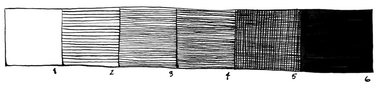
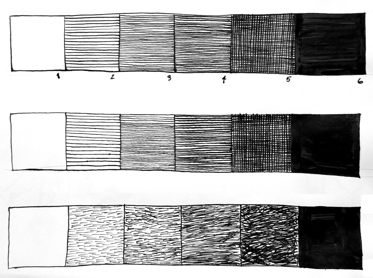
Let’s tackle six tones.
Why Pen and Ink for Tone?
Comics and illustration have a long history of being reproduced in black and white. Whether it was newspaper strips, manga, underground comix, or graphic novels, the printing process often couldn’t handle grayscale. Mimeograph? Janky old presses, copiers? We worked cheap. So we had to figure out how to create the illusion of gray using only pure black ink.
That constraint birthed an entire visual language.
Even now, in our age of digital color and unlimited production options, pen and ink tone work remains one of the most powerful and versatile tools in an artist’s arsenal. Why? Well, I’m glad you asked.
Production Benefits:
Reproduction friendly – Black and white line art prints cleanly, scans beautifully, and holds up at any size
Print cost efficiency – Single ink color means cheaper printing (crucial for zines, small press, self-publishing)
Clarity at small sizes – Solid hatching reads better than murky grays when printed small
Timeless aesthetic – Ink work doesn’t date the way some digital rendering does. And true gradients on crappy presses look terrible… patchy and unattractive.
Creative Benefits:
Forces intentional choices – You can’t hide behind gradient tools; every mark is a decision
Teaches value control – Understanding how the eye mixes black and white makes you a better artist in anymedium
Builds confident linework – There’s no undo button with ink (well, there is, but let’s pretend)
Bottom line: Learning to create tone with hatching makes you a more deliberate, more skilled artist. And it’s deeply satisfying in a way that pushing pixels around never quite matches.
Midtones: Your Value Vocabulary
When you’re working in pen and ink, you don’t have a tube of “medium gray” to squeeze out. Sure, you could mix a jar of 50% gray, but it’ll never mix the same twice. Instead, create the optical illusion of gray by controlling the spacing between your black lines. The viewer’s eye does the mixing for you.
Here’s the foundational value scale every inker should master:
Tone 1: Pure White
This is the paper itself. No lines. No marks. Pure, untouched white. Easy, right? Protecting your whites is a critical skill. It’s your negative space. It’s where your viewer’s eye rests.
When to use it:
Highlights, light sources, areas you want to feel open and airy, and the brightest part of any form. When it’s next to the darkest areas, you’ve got a focal point. Controlling this is the heart of composition.
Pro tip:
White is a tool. Protect it. Don’t fill every inch of the page. Negative space creates contrast and lets your blacks sing.
Tone 2: Light Gray (Wide Hatching)
Evenly spaced parallel lines with lots of breathing room between them.
When to use it:
The lit side of a form, atmospheric backgrounds, anything in bright light that still needs a little dimension.
How to do it:
Draw parallel lines at a consistent angle (usually 45° feels natural). Keep spacing wide—about the width of two or three line thicknesses apart. Maintain even pressure so your line weight stays consistent.
Pro tip:
If your lines are wobbly, slow down. If they’re too close together, you’ve jumped ahead to Tone 3.
Tone 3: Medium Gray (Closer Hatching)
Same parallel lines, but tighter spacing. You’re closing the gaps.
When to use it:
Mid-tones on a form, transitional areas between light and shadow, secondary elements you want to recede slightly.
How to do it:
Tighten the spacing between your lines so they’re closer than those for “light gray.” Keep the angle and line weight consistent with Tone 2 if you’re working on the same form—this creates smooth gradation.
Pro tip:
This is where gradients start to happen. You can transition from Tone 2 to Tone 3 by gradually bringing your lines closer together.
Tone 4: Dark Gray (Tight Hatching)
Now we’re getting dense. Lines are nearly touching, but you can still see the white paper peeking through. Another approach is to keep the spacing but make the lines thicker. Try both approaches. Pend and Ink is all about practice and preference. You learn preference from the practice.
When to use it:
Core shadows (the darkest part of a rounded form before it hits reflected light), heavy atmospheric effects, areas you want to feel enclosed or heavy.
How to do it:
Lines are spaced very close—almost touching. You’re really compressing that white space now. Keep your hand steady and your rhythm consistent.
Pro tip:
This is often as dark as you need to go before jumping to crosshatching. Don’t be afraid to stop here.
Tone 5: Near-Black (Crosshatching)
You’ve laid down one set of tight parallel lines. Now you add a second layer at a 45–90° angle.
When to use it:
Deep shadows, cast shadows, areas of maximum darkness where you still want a little texture (rather than solid black).
How to do it:
First pass: tight parallel lines (Tone 4). Second pass: another set of lines crossing the first at an angle. The eye mixes these overlapping lines and sees a very dark gray.
Pro tip:
You can do a third pass if you want to go darker still, but be careful—too much crosshatching can look overworked. Way too much means you’ve just worked to hard. In that case, you shoulda just spotted the black. If so, you’re in tone 6. Full Black.
Tone 6: Spot Black (Solid Fill)
This is it. Pure, unbroken black. No lines. No white showing through. Just ink. Usually, we use brushes for Spot Blacks. Often a round brush for the edges, and a flat for the interior.
When to use it:
Cast shadows, silhouettes, deepest darks, design anchors, anything you want to read as a bold graphic shape. Spot black creates drama, weight, and visual hierarchy.
How to do it:
Use a brush, a thick nib, or carefully fill the area with a pen. Make sure you cover every bit of white paper—no gaps, no streaks.
Pro tip:
Spot black is your loudest voice on the page. Use it strategically. It tells the viewer, “Look here. This matters.”
Putting It All Together
Here’s what a simple sphere looks like using all six tones:
Top highlight: Tone 1 (pure white)
Lit side: Tone 2 (wide hatching)
Turning toward shadow: Tone 3 (medium hatching)
Core shadow: Tone 4 (tight hatching)
Deepest shadow (with crosshatch): Tone 5
Cast shadow on table: Tone 6 (spot black)
The result? A flat circle that suddenly looks round, dimensional, and grounded in space. That’s the power of controlled value.
But Wait—There’s More (too Steve Jobsy?)
Here’s the secret: mastering these six tones is just the beginning.
Once you can control value (how light or dark something appears), the next question becomes: How do I apply these tones to describe form, texture, and space?
That’s where hatching direction comes in.
Do your lines follow the contours of the form (contour hatching)? Do they stay parallel and graphic (flat hatching)? Do they spiral, radiate, or break apart to suggest texture?
The answer is: it depends on what you’re drawing and what you want to say.
And that’s exactly what we’re going to explore all October long. A whole month? Hell yeah, the whole month. Maybe more if everyone loves it.
Welcome to HatchTober
In my Inking for Comics and Illustration class at the Art Students League of New York, we’re dedicating the entire month of October to hatching techniques. We’re calling it HatchTober, and here’s what we’re covering:
Parallel hatching for clean, controlled tone
Contour hatching to wrap lines around form
Crosshatching for depth and drama
Broken hatching for texture and atmosphere
Expressive hatching for mood and energy
When to ditch hatching entirely and commit to spot black (revisiting it. we’ve already done introductions)
Every week, we’ll tackle a new approach. Every week, we’ll see how different artists solve the same visual problem in wildly different ways. And every week, we’ll get stronger, more confident, and more intentional with our ink.
Because here’s the thing I’ve learned after years of teaching this stuff: Your way of inking is valid. There’s no single “correct” approach. The goal isn’t to make you ink like me, or like Steve, or like any particular master. The goal is to give you a toolkit, show you how other people use it, and then watch you build something that’s entirely your own.
That’s what makes the learning environment so rich. I bring my approach. You bring yours. We all level up together.
Start Practicing Now
If you want to get a head start on HatchTober, here’s your homework:
Draw six boxes in a row.
Box 1: Leave it white
Box 2: Fill it with wide parallel lines
Box 3: Tighten those lines
Box 4: Tighten them more
Box 5: Add crosshatching
Box 6: Fill it solid black
Try this exercise once a day for a week. Send lines in different directions. Use different tools—tech pen, dip pen, brush pen, whatever you’ve got. Notice how the same six tones feel different depending on the tool.
Once you’ve got the value scale down, try applying it to a simple form. Draw a sphere. Draw a cube. Draw an apple.
And then—if you’re in New York—bring that apple to class in October. We’re going to ink the hell out of it. Why an apple? Because Pumpkins are too damn big to carry on the subway at rush hour!
See You in HatchTober
Whether you join us at the Art Students League or you’re following along from your own studio, I’m excited. Pen-and-ink is a medium that rewards patience, practice, and curiosity. It’s unforgiving, yes—but that’s exactly why it makes us better.
Plus, there’s something magical about a room full of people hunched over their desks, pens and nibs scratching away, everyone solving the same problem in a completely different way.
No two inkers ink alike. But ten? It’s a wealth of creativity. I luv it!
Charles Merritt Houghton
30 September 2025
And that’s exactly how it should be.
Want to join us for HatchTober? Inking for Comics and Illustration meets at the Art Students League of New York throughout October. Check the ASL website for class details and registration.
Can’t make it to New York? Follow along here on the blog—I’ll be sharing techniques, demos, and student work all month long.
Let’s make October the month we master tone.
Let’s make the Bristol Paper sing.
XOXO