

♦[ART] Inking: Special Effects for Special Moments
Most artists use pen and ink for aesthetics—mood, grit, texture. But in comics, every stroke can do more: it can deliver information.

Conveying Information: A Shot-by-Shot approach
With the right choices, your inking tells readers how heavy a coat is, what time of day it is, or even how fur grows. Below is a working guide, organized not by technique but by shot type—the contexts you’ll actually face on the page.
1. Street Shot — Atmosphere, Time, and Material
When you pull back for a city street or landscape, readers need instant cues about space, time, and place.
Atmospheric Perspective: Thin lines and open hatching for distant buildings; heavier lines and dense blacks in the fore. It tells the eye where to land without blur gimmicks.
Time of Day: Long, low shadows in morning or dusk; short, tight shadows at noon. The length and angle of your cast shadows are story cues as much as design choices.
Surface/Material Cues: Polished car chrome? Use crisp, ribbon-like blacks with sharp highlights. Weathered brick? Broken hatching with irregular spacing. Your lines say what things are made of.
Example: A rainy night street. Streetlamps cast long slashes of black; car hoods read as shiny with bold highlight strips; distant towers fade to barely a whisper of line. Readers know instantly it’s wet, urban, and late.
2. Interior Shot — Gravity, Texture, and Light Direction
Inside a room, the details that matter are weight and material.
Fabric and Gravity: Folds tell us how heavy a curtain or coat is. Vertical “pipe folds” = heavy cloth; shallow diagonal creases = light fabric.
Light Directionality: Keep your shadow angles and densities consistent. A single lamp casts harder, smaller shadows; diffuse light softens edges. Consistency, not “realism,” makes interiors feel believable.
Texture as Information: Wooden beams? Grain hatching follows the plank length. Stone walls? Irregular, broken marks suggest roughness.
Example: A back-alley bar. A hanging coat looks heavy and woolen because of deep vertical folds. The overhead lamp makes sharp table-edge shadows. Wood grain hatching runs the length of the counter. The panel feels weighted, not generic.
3. Close-Up — Flesh, Fur, and Microstructure
Zooming in, your inking communicates structure at the scale of skin, muscle, and hair.
Hair and Fur Directionality: Strokes follow growth, not gravity. Tufts taper and overlap. You’re not just shading—you’re showing how fur flows.
Anatomy and Muscles: Hatching aligned with muscle fibers shows directionality; cross-contour hatching shows volume and curvature. Pick what matters for the scene: structure or form.
Surface Finish (Gloss vs. Matte): Crisp, high-contrast highlights say “sweaty skin” or “wet metal.” Softer feathering says “dry, rough, matte.”
Example: A villain’s close-up. Fur collar shows tufts radiating outward, not hanging down. His brow hatch follows muscle tension. Sharp highlights across his scarred cheek sell it as slick, stretched skin. Readers “know” what it feels like.
4. Non-Sequitur Panel — Symbols, Season, and Subtext
Comics thrive on panels that cut away from the main action—establishing mood, showing an object, or dropping symbolic imagery. Here’s where subtle ink effects shine.
Season/Environment: Crisp, long shadows plus open air hatching can imply winter; hazy, broken lines can suggest summer heat.
Moisture/Gloss: Reflections in puddles or sheen on glass can echo mood—horizontal, broken strokes for ripples, tight contrasts for shine.
Particles and Atmosphere: Dry brush or broken hatching for mist, smoke, or steam. It’s not “just white space”—it’s negative space carrying meaning.
👉 Example: A cutaway to a half-empty coffee cup. Soft feathering and short reflections tell us the mug is ceramic and matte. Steam rendered with broken dry-brush suggests warmth in an otherwise cold, hard-lined scene.
Why Group It This Way?
Because readers don’t decode your marks in the abstract—they experience them shot by shot. A street scene demands different signals than a close-up. By thinking in terms of what effect this panel needs to convey, you choose inking not for decoration but for information.
Pen and ink then stop being just style. They become story.
Charles Merritt Houghton
21 October 2025
Going Deep for Funsies:
Pen & Ink Effects for Comic Artists

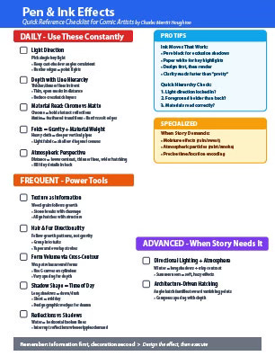
Daily (you’ll use these constantly)
Light direction (a.k.a. where is the lamp?)
Do: Pick a single key light. Keep cast-shadow angles consistent panel-wide; keep shadow strength consistent within the same light scenario. Use harder, clearer shadow edges for small/point lights; softer edges for big/overcast sources.
Ink moves: One clear shadow family (filled blacks or tight hatching), one light family (paper + sparse hatching). Save pure black for occlusion and contact shadows.
Why: Clarity reads faster than “pretty.”
Receipts: Gurney’s summary of Howard Pyle’s rule (“keep your shadows the same strength”) and notes on edge hardness with light size.
Depth with line hierarchy (foreground → background)
Do: Thicker/denser lines and higher contrast in the fore; thin, open, lighter marks in the distance.
Ink moves: Weight your contours in front; open up spacing and lighten pressure as planes recede; reduce crosshatch layering with distance.
Receipts: Nature-illustration guidance: “Use a stronger line for foreground… lighten up as you recede.”
Material read: chrome vs. matte
Do: Treat this as information, not garnish. “Highlights are specular reflections of the light source on shiny surfaces,” while matte surfaces scatter light. Short, high-contrast accents for gloss; broader, softer hatching for matte.
Ink moves: For chrome/metal, design bold abstract reflections: hard, ribbon-like blacks adjacent to paper white; tight silhouettes. For matte, feathered transitions and broken edges.
Receipts: Gurney on specular vs. diffuse; Oil Painters of America on specularity basics (applies across media).
Folds = gravity + material weight
Do: Choose fold types that match weight (pipe/diaper/zig-zag/half-lock/spiral/drop/inert). Heavy cloth → deeper, vertical “pipes”; light/stretch fabrics → shallow, diagonal, elastic creases.
Ink moves: Put spot blacks under fold “knee”s; vary hatch density to show thickness; sharpen outer fold edges where cloth kinks.
Receipts: Classic fold taxonomy reference (helpful shorthand when designing drapery).
Atmospheric perspective (with only black & white)
Do: Lower contrast, thinner lines, and wider hatch spacing as things recede. Kill tiny detail in the distance.
Ink moves: Background = open crosshatch (or none); midground = medium density; foreground = tight stacks, solid blacks.
Receipts: Teaching materials on hatching for value/atmosphere and exercises using pen widths for distance cues.
Frequent (power tools you’ll reach for often)
Texture as information (stone/wood/fabric—not “noise”)
Do: Make marks about structure: wood grain follows growth rings; stone breaks with cleavage planes; leather has irregular pores/creases; denim has weave direction.
Ink moves: Align hatch direction with real surface structure; modulate spacing to imply micro-rough vs. polished.
Receipts: Scientific illustrators explicitly use hatch length/spacing to encode depth/texture that photos miss (lithic example).
Hair & fur directionality (growth patterns, not gravity)
Do: Flow your strokes with hair growth patterns; avoid generic “downward fluff.”
Ink moves: Group strokes into tufts; taper and overlap; break outer contour into hair groups where appropriate.
Receipts: Nature-drawing guidance on using hatching to convey light, shadow, and orientation of surface planes; animal-fur tutorials reinforce “draw fur in the direction it grows.”
Form volume via cross-contour hatching
Do: Wrap strokes around forms; change stroke pitch across turning surfaces to advertise curvature.
Ink moves: Use S-curves and ellipses around cylinders, torsos, limbs; vary spacing to push/pull planes.
Receipts: Fundamentals: hatching/crosshatching to convey “texture, value, and the illusion of form and light.”
Shadow shape = time of day (story cue)
Do: Long, low-angle shadows = dawn/dusk; short = midday. Shadow direction anchors sun azimuth; edge softness suggests light size/clouds.
Ink moves: For sunrise/sunset covers, stretch casts and design big graphic wedges; for noon city fights, tighten everything under feet and cornices.
Receipts: Sun angle ↔ shadow length relations (geometry/edu sources); rule-of-thumb references; notes on edge hardness with light conditions.
Reflections vs. shadows (water, glass, glossy floors)
Do: Reflections obey surface orientation and can “win” over shadow color; shadows alter what you see of subsurface or environment tint.
Ink moves: On water/gloss, use horizontal broken lines; interrupt or compress reflections where ripples/texture demand.
Receipts: Illustration notes on how reflections interact with shadows in practice.
Advanced / Specialized (use when the story needs it)
Directional lighting plus atmospheric cues (season/place)
Do: Combine long winter shadows with crisper air and higher contrast; hazy summer noon with softer contrasts.
Ink moves: Pair shadow geometry with atmospheric openness/closure of hatching to hint season without a caption.
Receipts: Geometry-of-sun references and art instruction on time-of-day effects.
Architecture-driven hatching (space & order)
Do: Run background hatch sets in perspective to reinforce vanishing directions (Z-axis “air” hatching recedes).
Ink moves: Angle hatch families toward VPs; compress spacing with depth to echo foreshortening.
Receipts: Drawing pedagogy linking hatching, tonal contrast, cast shadows, and atmospheric perspective to model 3D space.
Bone/microstructure orientation (for medical/edutainment beats)
Do: Use localized hatch direction to suggest trabecular or fiber orientation when it matters to the plot or prop (e.g., surgical diagrams, biotech props).
Ink moves: Cross-contour inside the silhouette; shift hatch axis to reflect internal “grain.”
Receipts: Medical illustration’s mission is selective communication of structure; AMI examples discuss weighted/accented lines for form/readability.
Encodings of time/latitude (deep cut for worldbuilding nerds)
Do: If you want hardcore believability, angle and length your major casts according to the sun’s altitude/azimuth for the stated place/date.
Ink moves: Use s = h / tan A as a ballpark (shadow length), align casts to azimuth; don’t let math kill composition—design comes first.
Receipts: Simple engineering/forestry guidance on calculating cast lengths and plotting shadow direction.
Rare / Case-by-case (nice to have)
Moisture/“wet” read (rain, sweat, slick streets)
Do: Cluster tiny specular spots/white strips against dark masses; echo reflections under feet; increase local contrast.
Ink moves: Knife-edge whites (scrape or leave paper); micro-stipples near highlight falloff.
Receipts: Specular vs. diffuse logic applies directly here.
Atmospheric particles (mist/smoke/steam)
Do: Veil forms by subtracting detail/contrast; preserve silhouettes, drop interiors.
Ink moves: Dry-brush (or broken nib) for soft edges; skip-hatching; reserve whites to imply glare bands.
Receipts: General hatching/atmosphere instruction supports value loss + reduced detail as distance/air increases.