


♦♦[ART] The Printmaker’s Advantage: 3 Shin-Hanga Lessons Every Comic Artist Should Try
Comics and woodblock prints have more in common than you think—and that’s a good thing. Brilliant artists and colorists already use line techniques and gradient rules; you might try it, too.

If your comic pages lack the visual discipline to stand out, you're wrestling with a problem that's plagued artists for generations. Muddy colors compete for attention, fussy linework clutters the page, and team miscommunication leads to inconsistent results. Every comic creator has stared at a page wondering why it doesn't pop off the paper like the vision in their head.
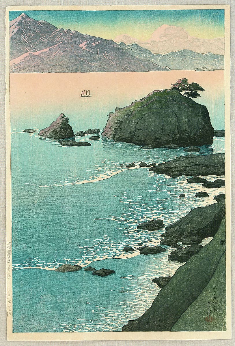
You're not the first artist to face these challenges. Printmakers like Hashiguchi Goyō, Kawase Hasui, and contemporary comic artist David Petersen already tackled those same problems—and solved them. I love Kawase Hasui and I’m inspired every time I see his work. For a bit of backstory, the Japanese Shin-Hanga movement (1915-1960s) developed a systematic approach to visual storytelling. It just happens to translate directly to our process in modern comics.
The solution? Borrow or steal their approach, as Austin Kleon means it —a responsible artist, not a thief. Keep your linework clean, your color intentional, and your team aligned.
The Shin-Hanga Workflow: A Blueprint for Comics, or Maybe Just a Refresher
Before diving into specific techniques, let's examine how Shin-Hanga actually worked, because the process itself holds lessons for comic creators.
The Three-Stage System
Stage 1: The Designer (Eshi)
Created the initial sketch and color guide
Made critical decisions about composition, mood, and visual hierarchy
Produced detailed instructions for subsequent stages
Stage 2: The Carver (Horishi)
Interpreted the design into bold, clear lines
Eliminated unnecessary details that wouldn't serve the print
Created separate blocks for different color areas
Stage 3: The Printer (Surishi)
Applied colors in precise sequence
Mastered gradation techniques (bokashi)
Ensured consistent results across multiple prints
How This Maps to Modern Comics
Your Shin-Hanga Stage → Comic Equivalent → Key Insight
Designer → Penciller/Layout Artist → Establish clear visual hierarchy from the start
Carver → Inker → Simplify and strengthen essential elements
Printer → Colorist → Apply color systematically with purpose
The genius of shin-hanga wasn't just the art—it was the process. Each stage had a specific role, and clarity of communication between stages was paramount.
Lesson 1: Master the Bokashi Mindset
What Shin-Hanga Did: Artists like Kawase Hasui used bokashi (gradation) not as decoration, but as emotional direction. A single gradient could shift a scene from peaceful dawn to ominous twilight.
The Comic Application: Instead of complex color schemes, use intentional gradients to guide emotional beats within panels and across pages.
Actionable Technique: The Three-Gradient Rule
Try This Tomorrow:
Pick three emotional beats in your current page or scene
Assign each a gradient direction:
Warm-to-cool for tension building
Light-to-dark for mystery/danger
Saturated-to-desaturated for flashbacks/memories
Apply consistently across related panels
Example in Practice: David Petersen's "Mouse Guard" uses this principle masterfully. Notice how his tavern scenes use warm, consistent gradients while outdoor adventures shift to cooler, more varied palettes. The color itself becomes a storytelling tool.
Common Mistake to Avoid: Don't use gradients everywhere. Shin-hanga artists knew when to use flat color for contrast. Gradients work because they're selective.
Lesson 2: The Carver's Discipline
What Shin-Hanga Did: Master carvers like those working with Hashiguchi Goyō eliminated everything that didn't serve the image. If a line couldn't be carved cleanly, it was redesigned or removed.
The Comic Application: Apply "carver's discipline" to your linework. Every line should either define form, create texture, or guide the eye.
Actionable Technique: The Carving Test
Try This Today:
Take a complex panel from your current work
Ask of every line: "If I had to carve this in wood, would it be essential?"
Eliminate decoration that doesn't serve story or clarity
Strengthen remaining lines with confident, varied line weights
The Shin-Hanga Line Hierarchy
Thick Lines (3-4pt): Silhouettes, major forms, panel borders
Medium Lines (2-3pt): Important details, facial features, key objects
Thin Lines (1-2pt): Textures, minor details, background elements
Implied Lines: Shadows, color boundaries, atmospheric effects
Example in Practice: Jeff Smith's "Bone" demonstrates this perfectly. His thick, confident outlines define characters clearly, while environmental details use thinner, more varied strokes. The result feels both detailed and clean.
Exercise: Redraw one of your panels using only three line weights. Notice how clarity improves.
Lesson 3: The Printer's Precision
What Shin-Hanga Did: Master printers developed systematic approaches to color application. They knew which colors to print first, how to achieve consistent results, and when to let the paper show through.
The Comic Application: Develop systematic color workflows that your team can follow consistently.
Actionable Technique: The Shin-Hanga Color System
Base Layer (Paper/Canvas): Always consider this your first "color"—sometimes the best choice is letting it show
Midtone Layer: Establish the dominant color mood for each page/scene
Accent Layer: Add emotional punctuation and visual hierarchy
Shadow Layer: Create depth and define form
Highlight Layer: Draw attention to key elements
Implementation in Your Workflow
For Solo Creators:
Establish your page's dominant color first (like a shin-hanga printer's base tone)
Add midtones to define major forms and spaces
Apply accents sparingly for maximum impact
Finish with shadows and highlights for depth
For Teams:
Penciller: Provide clear color notes and mood references
Inker: Preserve space for color to breathe (avoid over-rendering)
Colorist: Follow the established system, communicate changes back to the team
The Shin-Hanga Difference in Practice
Before Shin-Hanga Principles:
15+ colors per page competing for attention
Inconsistent line weights create visual chaos
Team members working in isolation
Readers struggling to follow the story flow
After Shin-Hanga Principles:
3-5 carefully chosen colors working together
Clear line hierarchy guiding the eye
Systematic workflow ensuring consistency
Readers effortlessly follow your visual storytelling
Next Steps
This Week:
Audit one recent page using the carving test
Try the three-gradient rule on your current project
Establish a basic color system for your next story arc
This Month:
Study three shin-hanga prints and analyze their color choices
Implement the line hierarchy system across multiple pages
Refine your team communication using Shin-Hanga role clarity
Long Term:
Develop your signature color palette inspired by shin-hanga restraint
Create workflow templates for consistent team collaboration
Build a reference library of effective shin-hanga techniques
Signing Off
Shin-Hanga artists faced the same challenges you do: making images that pop off the page, communicating clearly with collaborators, and creating work that resonates emotionally with viewers. Their solutions—systematic color application, disciplined linework, and clear team roles—work just as well for comics as they did for woodblock prints.
The difference between good comics and great comics often comes down to discipline. Shin-hanga gives you that discipline, tested over decades of printmaking mastery.
Try these techniques on your next page. Your readers will notice the difference, even if they can't name what changed.
Ready to dive deeper? Study the work of contemporary comic artists like David Petersen, Jeff Smith, and Mike Mignola—all of whom apply printmaking principles to create visually striking, emotionally resonant comics.
Here’s a link to David Petersen’s blog and his printmaking process. Enjoy:
https://davidpetersen.blogspot.com/2021/01/2021-bookplate-process.html
Charles Merritt Houghton
19 June 2025