♦[ART] Article 6 Print-Perfect Comics: 9 Details that Matter
Printing is hard. Check fonts, tune your blacks, be careful about margins and folds, and run periodic printouts to test your results. All be you hit "submit" with your Printing House.

You’ve learned about resolution, color spaces, scanning, file setup, and software workflows. But a few quirks can catch you off-guard when you send your comic to a printer. Here are some lesser-known pitfalls and tips to ensure you and your students have a hassle-free experience.
1. Overprint and “Rich Black” Issues
Overprint Settings
• Some printers allow or require black objects to “overprint” (blend with underlying colors rather than knocking them out).
• This is especially relevant if you have large black areas over colored backgrounds.
• In many software packages (Photoshop, Illustrator, InDesign/Publisher), an “Overprint Fill” option can be toggled on or off.
Rich Black vs. Pure Black
• Pure Black (K=100): Simple black ink with no added color inks. Recommended for text and small details.
• Rich Black (e.g., C=60, M=40, Y=40, K=100): Creates a deeper-looking black in large fill areas.
• Mixing these accidentally can cause color shifts or misregistration if not handled correctly.
Tip: Ask your printer if they have a recommended “rich black” formula (e.g., some prefer C=30, M=30, Y=30, K=100). For text, stick to pure black to avoid blurriness caused by misalignment.
2. Dealing with Fonts and Text
Embedding Fonts
• If you’re exporting PDFs, make sure to embed fonts or convert them to outlines (sometimes called “convert to curves”). This ensures your chosen font will appear correctly on the printer’s end.
Legibility Considerations
• Comic text can get pretty small, especially if you’re adding a lot of dialogue. Don’t let it get so small you can’t read it.
• Test print a page at full size to see if the text is easy to read—what looks clear on a screen might be too small in print.
Tip: Many printers recommend a minimum text size of about 6 to 8 points for standard comic lettering.
3. Double-Page Spreads and Alignment
Double-Page Spread Basics
• For two-page spreads, the center fold can slightly obscure the middle of the artwork. If crucial details lie in the gutter, they might be lost or distorted.
• Ensure any key content (like character faces, text, etc.) doesn’t straddle the exact spine.
File Setup
• Some printers want double-page spreads as a single, wider PDF page with bleed on all four sides.
• Others prefer two separate single pages, each with its own bleed. Check the specific guidelines from Mixam, Ka-Blam, or your chosen print service.
4. Specialty Papers, Finishes, and Color Variations
Paper Choices
• Glossy, matte, silk, or uncoated stock can each shift color or vibrancy differently.
• Thicker paper may change how your colors appear (some tend to print darker).
Specialty Finishes
• Spot UV, foil stamping, or embossed covers require extra planning. Communicate early with your printer, as these features often demand unique file setup (e.g., separate layers or spot color channels).
5. Bleed vs. Trim vs. Safe Area… Revisited
• Bleed: The extra border that gets trimmed off. Standard is 0.125” on each side.
• Trim: The final cut size of your comic’s page.
• Safe Area: A buffer inside the trim line where important visuals and text won’t risk being chopped off.
Common Mistake: Placing critical text or action details in the bleed zone. Once trimmed, that content might be partially missing.
6. Halftones, Screen Angles, and Moiré Patterns
Halftones
• Used to simulate shading in black-and-white comics or to achieve classic “dot” patterns in color. We used to call these Zip-tones, but they’re also known as Screen-tones. Amazon sells screen tone if you’re interested.
• When you scan or resize halftones incorrectly, moiré patterns (weird, wavy interference textures) can appear.
Preventing Moiré
• Scan original halftone art at 600 DPI or higher.
• If you see moiré, experiment with a slight rotation or use software tools (e.g., Clip Studio’s “Remove Moiré” filter).
7. Checking Page Order and Pagination
• Mistakes often happen when compiling the final PDF or placing pages in the right sequence, especially if using a separate layout program (InDesign, Affinity Publisher, etc.).
• Do a final check to ensure pages flow in the correct order—no repeated pages or missing chapters.
8. Test Proof Everything
• Soft Proofing: Viewing how a CMYK file might look on-screen based on a color profile (e.g., “U.S. Web Coated (SWOP)” for many U.S. printers). This helps catch drastic shifts before you print.
• Hard Proofing: Ordering a physical proof from the printer. This is the ultimate check for color accuracy, text size, and binding alignment.
9. Delays are Inevitable and Shipping Takes Time
Don’t forget shipping: It adds money and time. Overnight shipping of heavy, printed paper comics is MAD expensive. Don’t do it. Plan ahead so you have the time for ground shipping. Your wallet will thank you.
You must account for inevitable delays that happen in every print run. They happen. The back-and-forth with print house’s staff can add days to a project.
Ground shipping takes a fixed amount of time. And the weather only makes it worse.
If you need comics for that big convention, give yourself 6-8 weeks for printing and delivery.
Final Thoughts
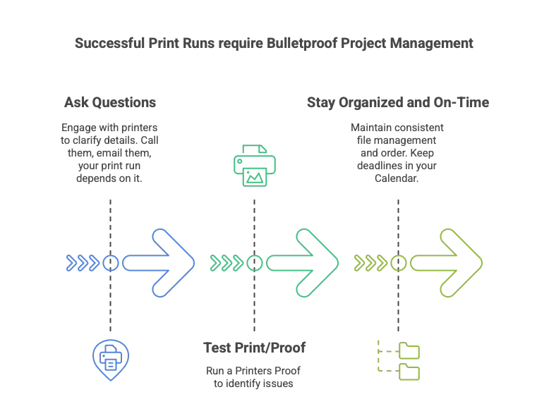
Students often feel overwhelmed by the technical aspects of printing, but a little awareness can prevent big headaches later. Encourage them to:
1. Ask Questions: Printers usually welcome queries before final submission. If they are responsive? Push them. If you can’t talk to somebody? Move your project to a different print house. It’s your money.
2. Test Print: Even a basic proof can reveal potential issues.
3. Stay Organized: Keep file names consistent, follow recommended specs, and keep final pages in order.
By considering these quirks and special cases, you’re ready to face any extra printing challenges that may arise.
Good luck, and may your comics print smoothly and arrive on time.
Charles Merritt Houghton
16 February 2025