

♦♦[ART] Beyond "Feeling": Why Composition Is the Backbone of Effective Visual Communication
When "designing" a page, panel, or canvas, what do we actually mean? I'm an architectural designer by degree, an industrial designer by experience, and an artist, and yet— even I'm not sure.

Sometimes, I think... "hmmmm, Design must must have something to do with being intentional." On other occasions, I lean toward its utility or a visual idea communicated to others, often for high-volume production. But those notions weren't satisfying, so I started digging.
Here's what I found:
The evolution of the term "design" from Renaissance disegno into modern practice reveals something crucial: design isn't just about how something looks—it's about how it works. Back to the "utility" idea.
This matters for anyone creating visuals. Whether you're illustrating, designing comics, taking photographs, or making digital art, understanding what makes "good design" isn't just academic—it's the difference between work that communicates effectively and work that falls flat.

Etymology and Linguistic Origins
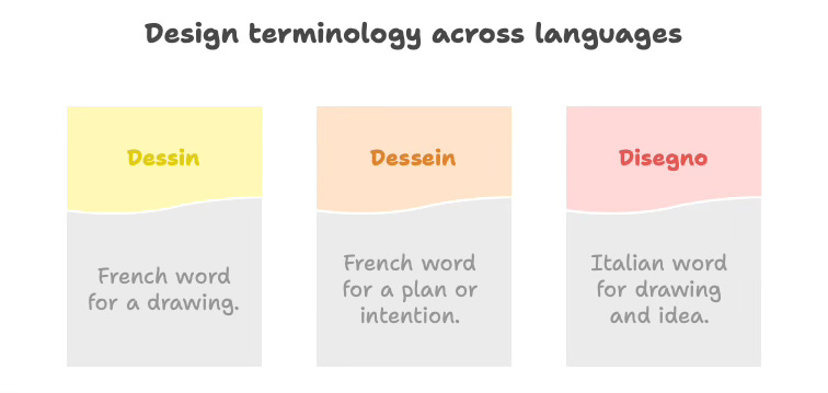
The English word "design" has a rich etymological history, tracing back to the Latin verb designare, meaning "to mark out, designate, or appoint." This Latin root passed into Italian as disegnare ("to draw or mark out") and the noun disegno, and into French as desseign (plan or purpose). By the mid-16th century, English had adopted the term "design" (noun) from French, initially meaning a purpose, project, or plan.
Interestingly, French eventually split the concept into two distinct words: dessin for a drawing, and dessein for a plan or intention, reflecting a separation that English does not explicitly make. The English word "design" thus encompasses both meanings—from an artistic sketch to a scheme or plan—leading to a richness but also an ambiguity that persists to this day. Meanwhile, Italian disegno carried dual meaning: both the physical drawing and the underlying idea behind a work of art. Ain’t languages fun?
The Design-Composition Connection
When I started making visual art, I approached composition like many beginners: "Does this feel right?" "What does my intuition say?" I would juggle elements around until the arrangement seemed pleasing, initially haphazardly but later with some confidence. Sometimes it worked; often it didn't. Perhaps I was missing the deeper meaning of "design."
The Renaissance masters knew better. When they spoke of disegno, they weren't just talking about drawing skills—they meant the intellectual conception behind the work. The plan. The intent. They understood that composition isn't accidental; it's deliberate.
This is why "designing the page" means much more than decorating it. It means creating a visual strategy that accomplishes specific goals.
What Makes Design "Good"?
"Good design" isn't subjective, at least not entirely. Most would agree. An annual report using the typeface Comic Sans or Papyrus is almost certainly "wrong." Unless you're Marvel or Paperie, those typographic choices just don't make sense.
Good visual design achieves what it sets out to do. Suppose the goal is to captivate viewers and hold their attention (often the case in painting and illustration). In that case, good design creates a visual path through a picture that rewards continued viewing and deeper engagement.
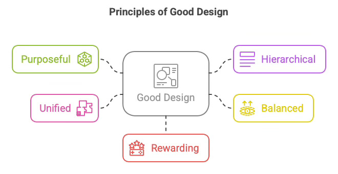
At its core, good design is:
Purposeful - Every element serves a function
Hierarchical - Information is organized by importance
Balanced - Visual weight is distributed intentionally
Unified - Parts work together as a coherent whole
Rewarding - Deeper examination reveals additional meaning
This is where many artists get stuck. They focus exclusively on self-expression—putting their feelings onto the canvas—neglecting the viewer's experience. Whose fault is this? The Abstract Expressionists. Really? No, it's really the fault of the painters who came after them, who were not classically trained and thought those slashes of paint were pure emotional expressions on the canvas. Those dynamic strokes are emotive, but there's a ton of knowledge and intention behind them. But lesser painters didn't know what they didn't know. They just saw the expressive bursts of paint.
Here's an uncomfortable truth: if you show your work to others, you're having a dialogue— 2 people, not 1. Communication requires transmitting information from one person and receiving it by another. Art without "receiving" is narcissism. If you're a true narcissist, you wouldn't be reading this article; you'd be doing whatever feels good to you. And this article ain't that.
The Viewer's Journey
Think about the last time you saw a painting or illustration that captivated you. What happened?
First, something caught your eye—a focal point that drew you in. That's the hook. Then, other elements guided your attention around the composition, revealing connections and meanings. The longer you looked, the more you discovered, each new layer of understanding rewarding your continued attention. Aren't those paintings great? Delacroix, Rubens, and Saville do that for me. Who does that for you? Leave your loves in the comments.
That wasn't accidental. It was designed.

Effective visual compositions create a journey for the viewer's eye.
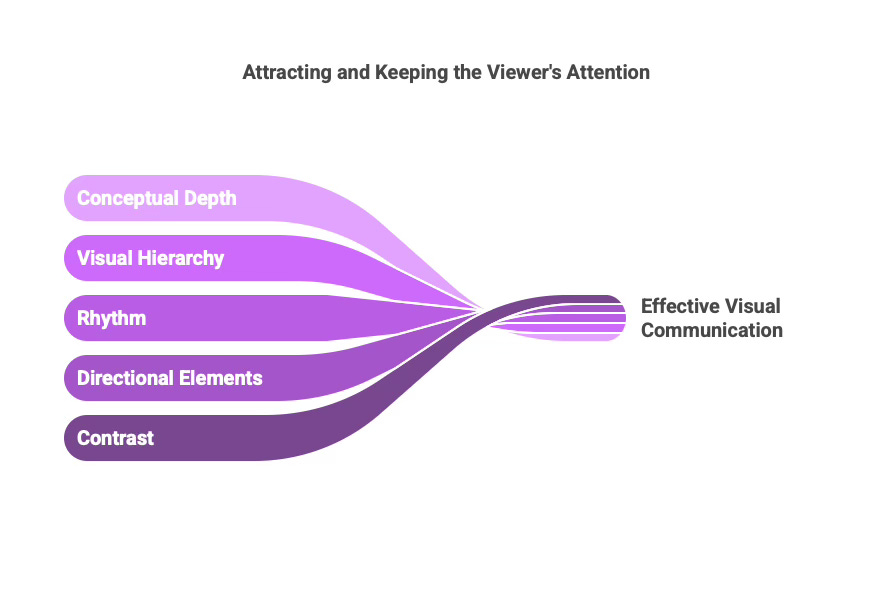
They use principles like:
Contrast to establish focal points
Directional elements to guide eye movement
Rhythm to create visual interest
Visual hierarchy to organize information
Conceptual depth to reward prolonged viewing
This is why merely having a "feeling" about composition isn't enough. Feelings are a starting point; they may be part of your intent, but understanding the adjacent principles helps you communicate better.
Charles Merritt Houghton
17 April 2025
Putting It Into Practice: The Action Plan
Enough theory. Let's get practical. Here are concrete steps to improve your visual design, regardless of your medium:
