Character Comparison Charts: Establishing Scale and Silhouette Across Your Cast
How do you capture the relationships and attitudes of each character? The Character Comparison Chart. All the players, their sizes, and shapes. Looks like a Perp Line-up, complete with height lines.


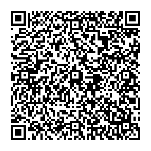
A character comparison chart isn't just a size reference; it's a storytelling tool. By showing your characters side-by-side, you reveal visual relationships that hint at attitudes, interpersonal dynamics, and defining shape language. The Chart serves two visual agendas: silhouette and proportion. These elements create instant contrasts that make characters memorable and help convey their relationships before a word is spoken.
Animation giants like Pixar and DreamWorks use comparison charts extensively. With diverse character casts, these studios leverage visual relationships—different heights, unique body shapes, and contrasting silhouettes—to communicate each character's role in the story. Usually, the shapes clue the audience into the Goodies, soft and smooth forms, from the Baddies, sharp and angular forms. It’s a simple trick, but it works.
For comic creators, a comparison chart accomplishes the same, providing a quick reference for each character's scale, posture, and shape language. The master chart is all about quick reads and intercharacter measurements. Nail it, and your visual story will read seamlessly. Miss it, and your readers get confused about which character is which.
WARNING:
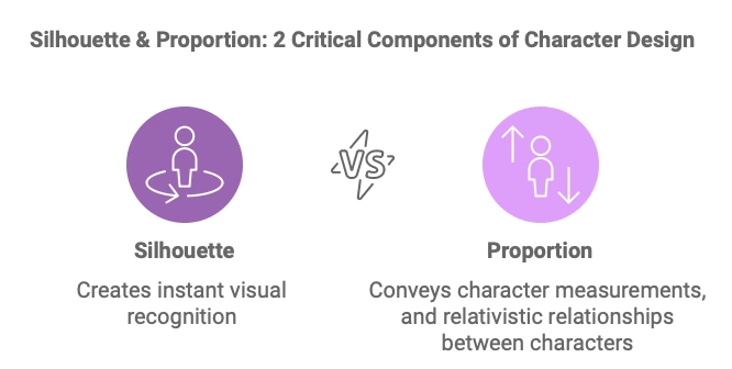
The character comparison chart is a practical tool for maintaining visual consistency. It keeps the reader focused on the story. It's designed for the artist as a straightforward and functional guide. Having a quick snapshot of each character's unique size, shape, and silhouette readily visible will be a godsend when you're in the flow. It saves time, preventing recurring searches for character sketches. It's not about perfection—it's a reliable, quick reference for visualizing character relationships, maintaining accurate proportions, and staying in the flow.
Why Use a Character Comparison Chart?
Comics, like animation, are visual stories. Every scene, interaction, and expression is an opportunity to communicate relationships and emotional stakes. It goes beyond creating a reference where you line up all your main characters side-by-side. It's a visual fingerprint of each character. Readers can tell, at a glance, who is who.
Define Power and Dynamics: Visual relationships—like a towering villain next to a small but courageous protagonist—instantly convey dynamics. In The Incredibles, Pixar contrasts the shape and size of Mr. Incredible and Elastigirl to reflect their partnership, strengthened by their divergent strengths, personalities, and attitudes.
Make Characters Recognizable at a Glance: Each silhouette in the Chart should be distinct. Unique silhouettes help readers identify characters quickly, even in crowded or action-heavy scenes.
Emphasize Unique Traits: A comparison chart lets you define each character's physical characteristics—a slender frame, a broad build, or a short stature—reinforcing their role and personality without relying on dialogue.
Critical Elements of a Character Comparison Chart
A character comparison chart highlights each character's silhouette and proportions. Here's what to consider for each:
Silhouette
Purpose: Silhouettes must read instantly. This is called the Gestalt Read. It’s like an old-school inkblot that’s clear instead of confusing. Each character's unique shape, size, and posture must be obvious. Strong silhouettes work without details or subtlety.
Tips: Line up characters in a pose that's natural for them. Capture their natural stance and ensure their shape is distinct from all the other characters. Avoid overlapping details to keep silhouettes distinct. Pixar frequently uses this technique, carefully crafting each character's silhouette to make them identifiable from a distance or at a glance.
Proportion
Purpose: Proportion defines relative size and body dimensions, communicating character personality, strengths, and weaknesses. Characters with exaggerated proportions—such as long legs, large hands, or broad shoulders—quickly convey agility, strength, or assertiveness. Are they slivers or Blobs? Get the three major volumes first, the head, torso, and hips, before moving on to arms, legs, hands, and feet.
Tips: Establish each character's height and body build in a side-by-side line-up. It should look like a Police Line-Up. In Shrek, body shapes reflect the personalities of Shrek, Fiona, and Donkey, reinforcing their roles and interactions in the story. This contrast in proportions enriches both the comedy and the emotional weight of their relationships, letting a story punch above its weight. Even Donkey’s scale relationship with Dragon reinforces the message that diversity and acceptance beat stereotypes and prejudice every time.
How to Create a Character Comparison Chart
Start with Basic Heights and Builds
Place each character in a neutral stance, lining them up side by side. Use the height of your main character as a reference and scale others relative to them. It's a visual anchor, ensuring consistent height ratios across scenes.
Establish Key Proportions and Body Types
Define each character's unique body type, whether they're tall and slender, short and broad, or medium-built. Pixar often contrasts body types (such as the broad, muscular Mr. Incredible next to the sleek and agile Elastigirl) to emphasize personality and function. In your Chart, take note of shoulder width, torso length, leg length, and any defining traits.
Emphasize Distinct Silhouettes
Each character's silhouette should be unique. If a character has a prominent feature, like a rounded belly, pointed hat, or long cape, include these in the silhouette without adding internal details. The silhouette alone should reveal the character's essence—distinct and unmistakable. This is especially helpful in scenes where characters may be seen from afar or in highly dynamic panels.
Label Heights and Key Details
Under each character, add a note with their height or critical measurements. If certain characters are meant to be noticeably taller or shorter than others, this is the place to lock that in. These quick notes can be a godsend for keeping you in an artistic flow state, where you're drawing intuitively, not thinking furiously. Include small notes on other physical attributes if they're essential, like "broad shoulders" or "short legs," which can influence how you draw their movement.
Include Gesture or Stance Variation if Relevant
Consider including this in your comparison if your characters have notable postural differences, such as a slouch, a hunched back, or a habit of standing upright. These minor differences add life and variety to the character line-up, making each character visually unique.
Actionable Tips for Using a Character Comparison Chart
Keep It Accessible: Place your comparison chart somewhere visible when you're drawing. Refer to the Chart to keep sizes and shapes consistent, especially when multiple characters are present in the panel. It's helpful to quickly glance at it comparing heights and widths.
Use It to Guide Group Interactions: When characters interact, their relative sizes affect how you position them in panels. A taller character might have to lean down, while a smaller character might crane their neck upwards—these angles add believability to the scene and nuance to their relationship. All in one Chart. What's not to love?
Let Silhouettes Inspire Composition: Distinct silhouettes can help you create visually engaging compositions. If one character has a broad shape and another is slim, you can use their contrasting silhouettes to balance and complement each other within a panel.
Lessons from Animation: Visual Relationships as Storytelling Tools
Animation studios like Pixar and DreamWorks use character comparison charts to set the foundation for storytelling through visual relationships. When Pixar developed the character line-up for The Incredibles, the size and shape differences between Mr. Incredible, Elastigirl, Dash, and Violet highlighted each character's unique abilities, personalities, and even insecurities.
This method gives visual cues reinforcing the story's emotional dynamics and power relations.
By considering how characters' physicality compares to other characters, you create a visual shorthand for their personalities, relationships, and conflicts. This is particularly effective in comics, where limited panel space uses shape language for maximum visual impact.
Adding Body Language to Your Character Comparison Chart: Capturing Core Physicality and Attitude
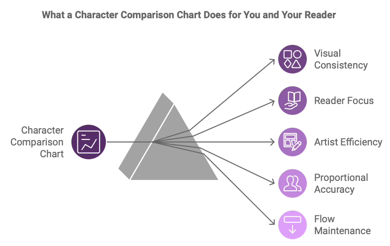
Body language is a powerful part of character design, and incorporating it into your character comparison chart can bring an extra layer of personality and depth. While a neutral stance is helpful for height and proportion reference, adding each character's core physicality—the natural posture or body language that best represents their personality—can make the Chart a more dynamic storytelling tool.
Neutral Poses and Intense Body Language are both valid approaches.
I don't know which I'll use, and I certainly don't know which direction you should go. It's your tool. Pick one, ask yourself which one serves you, the creator, more effectively, and draw that one.
Consider the essence of each character's movement and stance. Are they bold and assertive, standing tall with squared shoulders? Or cautious, with a slight slouch? Or a posture that curls inward, conveying a retreating, guarded nature? It's all visual subtext, adding richness to your story. It's also your Chart. Make it work for you.
By defining these physical traits in the comparison chart, you're setting the foundation for how each character naturally inhabits space, helping you keep body language consistent across scenes. Animation legends like Glen Keane and Disney's The Illusion of Life emphasize the importance of core physicality to convey personality in every movement. In the world of comics, this same approach can subtly reinforce character traits and add depth to interactions.
Put the character's core physicality right into your character sheet. Does that character slouch? Or do they puff their chest out with buoyant bravado? A little goes a long way here. Getting it on the page, front and center in your comparison chart, ensures your characters read at a glance. Quick gesture sketches can serve as shorthand for a character's emotion.
Into the Final Stretch
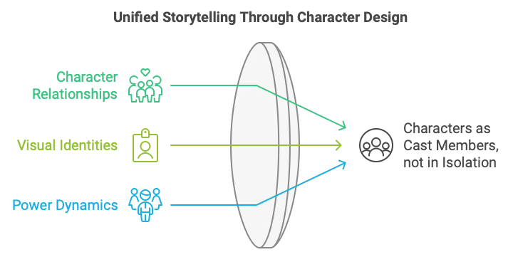
The character comparison chart is more than a height guide; it's a storytelling tool that captures your main characters' unique relationships, power dynamics, and visual identities. The chart creates a clear visual language for all the characters using clear silhouettes and defined proportions.
The Chart is there to ensure your cast feels cohesive. With this Chart, and at a glance, your characters are no longer isolated figures—they become a cast shaped by relationships with one another.
A strong Character Comparison Chart provides a quick, visible foundation and guide for drawing each scene and panel, enhancing the emotional weight of your story.
So that’s that. Article 4 in a 4-Article Series on Character Sheets. I’d like to thank Sloane for asking about Character Sheets. I’d never fully appreciated the variances between the three tools: the 3-View, the Expression Sheet, and the Character Comparison Chart. I’ve drawn versions of each but never ruminated on the purpose of each. I’ve got a much clearer idea now and hope you do, too.
If they sound like a lot of work, they are. And for minor characters, they’re overkill. But they'll earn their keep if you’re drawing an epic spanning dozens or hundreds of pages.
Charles Merritt Houghton
18 November 2024
Want to learn what an Expression Sheet is? Link Here: