


Is Your Lettering Chaos on the Page? A Blueprint for Keeping It Legible
Lettering seems like a pain, but it really shouldn't be. If you neglect it, it can kill a reader's interest in minutes. Do you really think they'll come back once they set it down?

Here’s a guide to lettering your comics projects. It’s critical. Have you ever watched YouTube videos where the audio is horrible and painful? Hurts, right? Bad lettering hurts the same way; it's just their eyes instead of their ears that you’re hurting. Don’t be that way. Be kind to your readers. We love them.
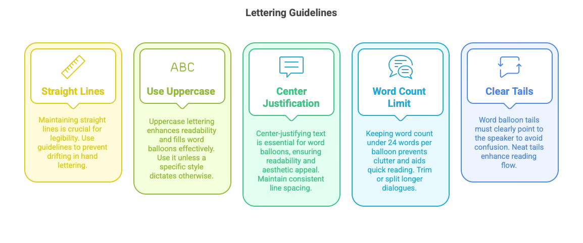
Straight Lines Are Essential
Fundamental to lettering is maintaining straight lines. Wandering text kills legibility. Consistent baselines and height lines are crucial as they guide the reader's eye effortlessly. If you're lettering by hand, using guidelines or a light box can prevent drifting. For digital lettering, straight is the default.
All Uppercase (Unless You've Got a Very Good Reason)
Unless you have a clear stylistic choice, uppercase is standard. It eliminates ascenders and descenders, boosting overall readability. Master letterers like Nate Piekos and Todd Klein emphasize that uppercase lettering neatly fills word balloons and stays crisp, even when space is tight.
Center-Justify and Keep Line Spacing Consistent
Center-justifying your text is required for word balloons, whether oval or rounded rectangles. Ensure at least one letter's worth of space between the text and balloon edges. This minimal white space around the text is crucial, as it is pleasing to readers' eyes.
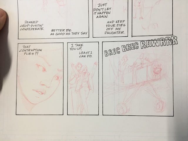
Limit Word Count to less than 24 Words Per Balloon
Big blocks of text can intimidate and slow down your audience. Try to keep speech bubbles below 24 words. If your dialogue runs longer, split it up or trim it. This ensures quicker reading and keeps panels visually uncluttered.
Word Balloon Tails Must Point Clearly and Never Cross
Tails tell us who is talking. Confusing tails disrupt reading flow and leave readers guessing. Keep those tails neat and point them carefully toward the speaker's mouth or face.
Workflow Considerations
If you letter early (i.e., inking your text right after your panel borders), you avoid drawing detailed backgrounds that get covered by balloons. This also allows you to position your speech balloons without guessing. On the other hand, some artists prefer to draw the art first and add text digitally later. Pick whichever approach fits your schedule and creative style.
A Workaround for Hand Lettering
Lettering your dialogue digitally in a comic book font that matches your preferred style and then using a lightbox to trace it merges the precision of digital lettering with the personal flair of hand lettering. You maintain neat baselines and spacing and incorporate your own natural stroke.
Digital Tools
If you work in Photoshop, Procreate, or Clip Studio Paint, simply select or install a comic font (like many from www.Blambot.com), create separate layers for balloons and text, and leverage alignment features. Whether you go digital or analog, your goal is clear, consistent lettering that enhances the art. Clarity is King.
Reducing Anxiety and Meeting Deadlines
Plan text early to avoid surprises. If you see a balloon pushing 24 words, pare it down or split it. Remember to build in a cushion for last-minute corrections; scrambling at the eleventh hour happens. It’s a fact of life. The key is establishing a flexible system, ensuring clarity, and boosting your own confidence.
Closing Thoughts
Lettering can feel like a chore, but it is fundamental in comics. Straight baselines, uppercase letters, center-justified text, limited balloon word counts, and well-aimed tails remove confusion and highlight your story. Take cues from top-tier letterers like Piekos and Klein, and you'll keep readers immersed in your narrative. The right lettering isn't just decorative—it's the reliable voice leading your reader through every panel, every page, and every dramatic moment of your comic.
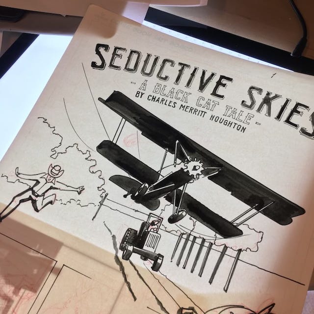
Charles Merritt Houghton
13 February 2025
LET’S GET GRANULAR: A STEP-BY-STEP GUIDE TO LETTERING COMICS
Below are four methods, broken down in detailed steps.
1. HAND LETTERING USING A RULER
1. GATHER YOUR TOOLS
You'll need a ruler (preferably clear so you can see the lines underneath and the panel borders), a pencil, and a fine-tipped ink pen or marker (e.g., Micron 0.5mm or a similar).
Have your comic page (or a practice sheet) ready, along with an eraser.
2. CREATE LIGHT PENCIL GUIDELINES
Decide on your letter height, for example, 1/4” for uppercase letters in a standard comic on standard 11x17 comic paper.
Lightly draw two parallel lines across your panel using the ruler. These lines form the top and bottom of your lettering row.
Make the space between lines 1/2 the height of your text, about 1/8”.
3. MAP OUT YOUR BALLOONS OR TEXT AREAS
If you have word balloons, lightly sketch them in pencil, leaving enough white space (at least a letter's width) on each side of your planned text.
Decide where your balloons will go so they don't obscure important artwork.
4. WRITE YOUR TEXT IN PENCIL FIRST
Use all uppercase letters, spacing them consistently. Keep them between the guideline pair.
Maintain uniform spacing between each letter and word.
5. INK YOUR LETTERS
Once your pencil letters look solid, go over them with your fine-tipped pen. Use the ruler edge if you need help keeping things straight.
Apply consistent pressure so your lines have a steady thickness.
6. ERASE THE GUIDELINES
After your ink dries, gently erase your pencil lines and any balloon sketches.
The result should be crisp letters in neat rows.

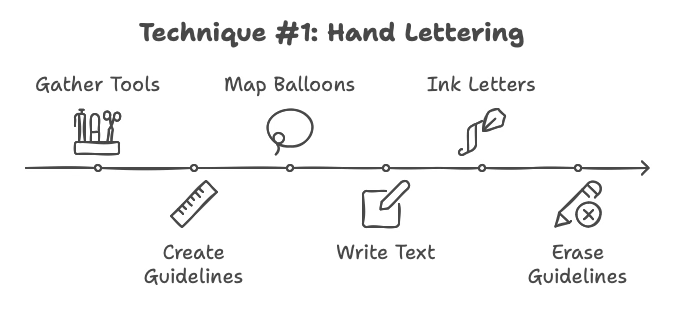
KEY TIP: Straight lines are your greatest friend. Wobbly text is distracting, so take your time with that ruler.
2. HAND LETTERING USING AN AMES GUIDE
1. UNDERSTAND THE AMES LETTERING GUIDE
The Ames guide is a small plastic tool with holes and a rotating disc determining line spacing. Use a mechanical pencil so it will fit into the holes on the Ames guide.
It helps you create evenly spaced guidelines for your lettering height and the distance between lines.
Use the diagonal row that has trios of holes to draw the top line, the bottom line, and the top line of the line below. This guarantees proper spacing.
2. SET YOUR LINE SPACING
Rotate the central disc to match the scale or row height you need. For standard comic text, Steve suggests using 3.5 on the dial for standard comic interior page paper. Your height and spacing may vary, but probably not widely.
3. DRAW YOUR GUIDELINES
Place the bottom edge of the guide along a straight line (like the edge of your board or a T-square) and move the pencil through the appropriate holes to draw horizontal lines.
Repeat across the width of your balloon. This creates perfectly spaced lines for letter tops, letter bottoms, and any extra spacing you want between rows.
4. SKETCH YOUR BALLOONS AND COMPOSE TEXT
Lightly pencil your speech balloon shapes first (ovals, rectangles, etc.).
Pencil your text in uppercase inside these guidelines.
5. INK THE LETTERS
With your pencil letters in place, carefully trace them with a pen or marker. Keep your strokes consistent.
Avoid rushing. Each letter should look uniform in height and spacing.
6. CLEAN UP
Let the ink dry fully, then erase the pencil lines.
The Ames guide ensures your text lines won't wobble and maintains a polished look.
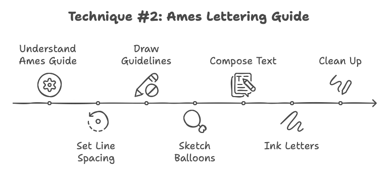
KEY TIP: The Ames guide is a classic tool. Legendary letterers and drafters rely on it for professional, even spacing. It's worth spending a little time learning its settings to get consistently beautiful results.
3. LIGHTBOXING WORD-PROCESSED TEXT AND HAND-DRAWING ON THE PAGE
1. TYPE YOUR DIALOGUE
Open a word processor or lettering software.
Center-justify the text to mimic typical comic speech balloon formatting.
Use uppercase for clarity. Choose a comic-friendly font (e.g., one of Nate Piekos's Blambot fonts) that matches your aesthetic.
 CMH")
2. ARRANGE AND PRINT
Adjust point size until the lettering comfortably fits the balloon shapes or panel size you have in mind. I use 10.5pt type usually.
Print the text out on regular printer paper at actual comic size (usually 10" x 15" or proportionate to your final trim).
3. SET UP YOUR LIGHTBOX
Place your printed text on the lightbox.
Tape or secure your artboard or comic page on top so it doesn't shift.
4. TRACE THE LETTER FORMS
With a pencil, lightly trace the outlines of the printed text onto your page.
Keep an eye on spacing. Make sure you have enough margin between the letters and the edges of your balloon shape.
5. INK OR TIGHTEN THE LETTERS
Switch off the lightbox once you've penciled the text.
Using your preferred ink pen, letter over the pencil guidelines.
After the ink dries, erase any stray pencil marks.
6. ADD BALLOONS AND TAILS
Lightly pencil the balloons around your text, ensuring at least one letter-width clearance.
Pencil in tails pointing clearly to each speaker.
Ink the balloons and tails, then erase pencil marks.
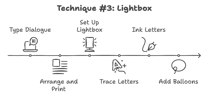
KEY TIP: This method blends the precision of digital text layout with the handmade feel of traditional inking. If you want consistent letter height, this is your best bet, but you also crave that personal, organic look.
4. DIGITAL LETTERING ON AN ANALOG PAGE
1. SCAN OR PHOTOGRAPH YOUR FINISHED ART
Once your artwork (pencils/inks without lettering) is done, capture a high-resolution image.
If you plan to print, aim for at least 300 dpi; 600 dpi is often recommended for crisp lettering.
2. IMPORT INTO A GRAPHICS PROGRAM
Use software like Photoshop, Procreate, Clip Studio Paint, or Illustrator.
Create a new layer above the art for your lettering.
3. SELECT AND INSTALL A FONT
Choose a comic lettering font (Todd Klein suggests fonts with uppercase orientation for clarity; Nate Piekos's Blambot offers many).
Adjust the size so it fits within the approximate balloon areas you've envisioned.
4. TYPE AND SHAPE YOUR WORD BALLOONS
Center-justify your text on a text layer, setting line spacing (leading) to give it breathing room.
Add balloon shapes on another layer using the software's shape tools or freehand drawing. Maintain consistent spacing around the text.
5. ADD TAILS
Draw or use vector shapes for the balloon tails. Position them to point clearly at each speaker. To preserve clarity, avoid crossing the tails.
6. EXPORT YOUR FINAL FILE
Hide any guidelines or rough layers. Merge or flatten only when you're confident everything looks good.
Save a print-ready version (e.g., PDF, TIFF). Then, save the layered source file as a backup in case you need to make edits later.
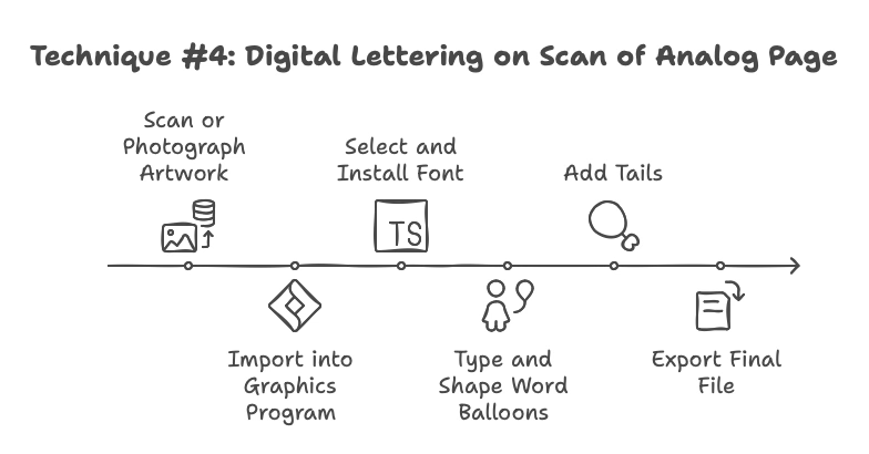
KEY TIP: With digital lettering, you can easily rearrange balloons, scale text, and correct typos before the final output. This flexibility is a huge advantage, especially under tight deadlines.
SUMMARY AND FINAL WORD
Regardless of which method you choose, remember your end goal is clarity. Straight lines, readable spacing, and well-placed balloons ensure the dialogue flows. Some creators love the tactile nature of hand lettering with a ruler or an Ames guide. Others enjoy blending digital tools with a personal touch, like lightboxing typed fonts or onto scanned analog pages. And if you wanna go full digital lettering, go for it. Edits are easier.
Pick whichever approach fits your style, budget, and deadline. If you keep your lettering consistent, your reader stays immersed in the story. If your text disappears into the story… you win! When your lettering is spot-on, readers stay engaged.