

RGB vs. CMYK: The Color Details Every Comic Creator Must Know to Avoid Costly Printing Mistakes
Printed your comic, and the colors look wonky? You're not alone. Let's break down the difference between RGB and CMYK so you can finally get your colors right.

As a comic creator, your colors are a huge part of your storytelling. But here's the problem: what looks perfect on your screen can turn into a dull mess when you print it. If that happens, you're probably using the wrong color mode. So, let's break it down in plain language: RGB is for screens, and CMYK is for print. Knowing this could save you a ton of frustration, money, and time.
This hassle applies to printing in general.
If you’re an artist going to print, pay attention!

You Should Care About RGB vs CMYK? Seems overly technical, right?
If you want your comic to look its best both online and in print, you need to know when to use RGB and when to use CMYK. The difference between the two isn't just technical mumbo-jumbo—it's why your vivid blues turn to washed-out gray on paper. Skip this, and you'll end up with print runs that disappoint you, wasting both your enthusiasm, creativity, and your cash.
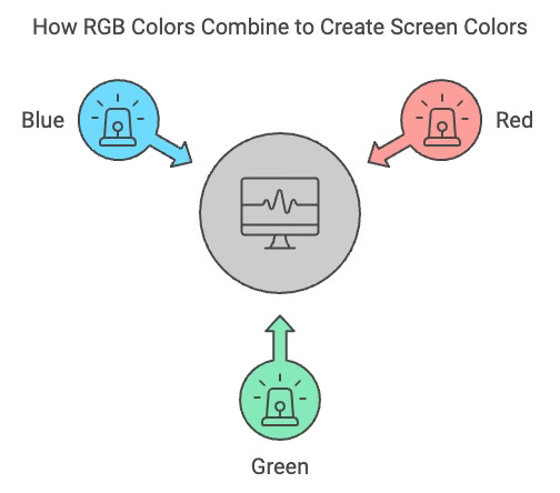
What is RGB?
RGB stands for Red, Green, and Blue—the three colors of light that screens used to display images. When these colors mix, they create all the other colors you see on your device. Think of it like this: screens are like little lamps, shining light at you. When they're all shining bright, you get white. When they're off, you get black.
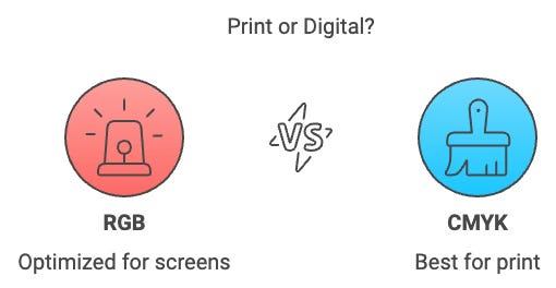
Why It Matters: RGB gives you a vast range of colors, especially those bright, glowing ones that pop on your screen. If you're making a comic for digital viewing only—on websites, tablets, or social media—RGB is the way to go.
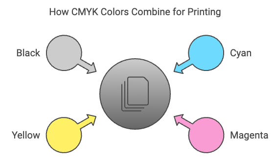
What is CMYK?
CMYK stands for Cyan, Magenta, Yellow, and K (Black). This mode is for printing. Unlike screens, which emit light, printed colors result from ink absorbing light. The more ink you add, the darker the color gets. This ink mixing is why printed colors often look more muted compared to what you see on your screen.
Why It Matters: CMYK has a smaller range of colors than RGB, meaning some vibrant hues you see digitally can't be perfectly recreated in print. If your comic is destined for a high-volume printer, you must work in CMYK from the start to avoid surprises and sadness.
The Color Gamut: Why Some Colors Don't Print Right
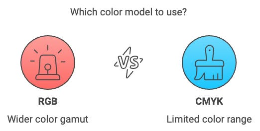
Here's the deal: RGB has a much wider color gamut, which can show more colors, especially bright, intense ones. CMYK, on the other hand, has a narrower color gamut. When you try to print colors outside the CMYK range (often those super-bright blues, greens, and purples), they get replaced with the closest possible match, which usually looks duller.
What Happens When It Goes Wrong: If you've ever seen a bright blue on your screen turn to a washed-out navy on paper, that's the color gamut issue in action. You designed it in RGB but didn't translate well to CMYK for print.
Programs and Color Modes: Why Procreate Isn't Enough
Programs like Procreate are built for digital workflow and products, so they work in RGB. This may change. Companies improve their software all the time, but you’ll never know when. And still, that image on your monitor is formed by mixing Red, Green, and Blue light. That ain’t a print, even if your color is set to CMYK. Just know what a monitor, at best, approximates printing colors. At worst, your computer doesn’t even consider the difference. RGB is perfect if your comic is staying on screens. But if you want to print your comic, you'll need software like Adobe's Photoshop, which lets you switch to CMYK mode. You’ll get a LOT closer.
Avoiding Color Disasters
Start with the End in Mind Decide up front: is this comic for digital use or print? If it's for print, start your project in a program that supports CMYK, like Photoshop.
Convert Before Printing If you created your comic in RGB, convert it to CMYK in Photoshop before you print. This way, you'll see how the colors change and can make adjustments to get the best result.
Use Soft Proofing In Photoshop, use "Soft Proofing" to preview what your RGB colors will look like in CMYK. This gives you a heads-up on any color shifts before you hit 'print.'
Avoid Super Bright Colors Planning to print? Avoid using super-bright, neon colors. They often fall outside the CMYK gamut and will look flat in print.
Save Separate Copies When converting to CMYK, save a separate copy of your file. Keep your original RGB version for digital use, and adjust the CMYK version for printing.
When to Use RGB vs. CMYK
- Use RGB: When your comic is for screens, websites, social media, and tablets,
- Use CMYK: When your comic is for print, use comic books, posters, and merchandise.
A Special Note: Photographic Inkjet Printers are an Exception to the Rule
They Have a Wider Color Gamut than Presses
You might have noticed that when you print your comic on a photographic inkjet printer, the colors can look richer and closer to what you see on your screen. Such inkjet printers have more than just the four CMYK inks—they can include extra inks like light cyan, light magenta, and sometimes even extra blues, reds, or grays. My Epson uses 8 colors. And mama, each cartridge is EXPENSIVE. This expanded ink set gives my inkjet printer a super-wide color range. Much more than what a standard CMYK press can produce. However, this wide gamut is usually only possible with high-quality inkjet printers, not with the presses used for mass production, unless you're going onto a fancy 10-plate press. Very Pricey! So, while inkjet prints look amazing, the colors may still shift when you move to a traditional CMYK press for your final comic book run.
Here's the gotcha! When you have to collate, fold, and staple these yourself, you start cursing the stars. The first comic is exciting. The second and third are cool. And beyond that... "Ugh, I HATE this. Should have sent it out, making it someone else's problem."
Bonus Section: How to Handle a Hybrid Project (Print and Digital)
If you want your comic to look great on both screens and in print, you don't have to pick just one—but it does take some planning. Here are your options:
Use a Limited Color Palette: Choose colors that work well in both RGB and CMYK. Avoid super-bright colors that won’t print correctly. It’s simple and saves time. For example, Neon Colors work in Digital but are a no-go for printing.
Color in CMYK, Convert to RGB: Start in CMYK mode for print, then convert to RGB for digital. This keeps your colors consistent in print and works fine for screens. A few VERY rare colors in CMYK aren’t in RGB.
Color Twice: Create two versions—one in RGB for digital and one in CMYK for print. It’s extra work, but you get the best results for both formats.
Use Adjustment Layers: If you’re comfortable with Photoshop, use adjustment layers to tweak colors for print without changing your original RGB artwork. This is an advanced Photoshop technique, but it’s effective if you learn it. And you SHOULD learn Photoshop! It’s an industry-standard software.
Bottom Line: You can make it work for both, but it’s about compromise and choosing the method that fits your workflow.

This diagram looks complicated. Color IS complicated. But, pay attention to the Purple Line “SWOP CMYK” and compare it to “Adobe RGB 1998.” Note how the greens and violet/purples are seriously underrepresented in CMYK. Those are the colors missing from your CMYK palette of available colors.
It Pays to Get This Right
Knowing the difference between RGB and CMYK isn't just about avoiding print disasters. It's about making sure your hard work pays off. Your comic looks as good as it possibly can. You want that, right? Next time you start a comic project, choose your color mode based on where your story will live. Nail this, and you'll save yourself a world of headaches, and more importantly, you'll bring your readers into the world you've created as you intended it. Accidents like choosing the wrong color space have never worked in my favor. Doesn’t happen. And seems risky to run your life going from accident to accident. Bad Bet, to my thinking.
Happy Comicking, Friends. This feels technical, but it’s worth the brain cells.
Charles Merritt Houghton
28 September 2024